| portfolio |
 |
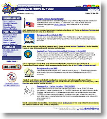
Sabah.Net ver 2URL:http://www.sabah.net.my/ Complexity: Advanced Period spent to complete project: 3 months Completion date: February 2001 |
| This is Sabah's official
web site, and one of my "babies". This project is very close to my
heart and I can proudly say that I was the first officially-titled Webmaster for Sabah.Net. Soon
after its launching, together with a team of systems and network
engineers, I coordinated and initiated the free Sabah.Net web hosting service,
and I was very much involved in all aspects of web-related services concerning
Sabah.Net, whether it be design, maintenance or customer support.
For the first version of the site (view snapshot of old site), I built applications such as its guestbook using server-side Javascript. I also came up with the initial design of the Sabah.Net logo which was then enhanced with the yellow network lines by Murphy Ng and became what it is today. In a nutshell, it was a one-(wo)man show all the way until mid 1999 when we started to properly recruit a team of web engineers. I was more involved in the planning, design and implementation of the 2nd version of the site. I proposed and provided the templates, standardisation and guidelines, as well as deciding the tools and technologies that should be used for the site. Since it was migrated from Netscape Enterprise web server to IIS, it could now use technologies such as Active Server Page, Microsoft SQL server, Oracle, and many more. The site is now more manageable, with a customised web-based console to handle almost all types of content and updating administration throughout the site. With the console in place, the work and time needed to maintain the web site has been decreased to more than half the effort. For example, the announcements on the front page used to take 1 to 2 hours to update, but now it only takes 5 to 10 minutes to update the page using the administration console. The Calendar of Events used to take us half an hour to update, but now it takes less than a minute to do so. Visit the Sabah Electronic Government homepage (another personal favourite of mine, same case as Sabah.Net) at http://www.sabah.gov.my (view snapshot of old site), and Education Net homepage at http://www.sabah.edu.my and note the resemblance in layout. It uses a specific colour to identify each site, according to the standards that I proposed. The layout is the same throughout the sites to provide a sense of identity, since they belong to the Sabah.Net network. Tools & skills used: HTML, Allaire Homesite, Notepad, Adobe Photoshop, Active Server Pages (server-side JavaScript), client-side JavaScript, Microsoft SQL Server 2000, Oracle 8i, Cascading Style Sheet (CSS), Internet Information Server 5.0. |
|